Carbon Design System
Carbon is IBM’s open source design system for products and digital experiences. With the IBM Design Language as its foundation, the system consists of working code, design tools and resources, human interface guidelines, and a vibrant community of contributors.
Overview
Over the past eight years, I have helped evolve Carbon from a design system primarily focused on IBM Cloud into the unified design system used across IBM's software portfolio.
As IBM streamlined more than 15 independent design systems into a single source of truth, Carbon expanded to support a broad range of products, platforms, and teams with vastly different needs. This transformation required building a scalable system capable of supporting enterprise software at an unprecedented level while maintaining consistency, accessibility, and a shared design language.
Today, Carbon provides the foundational components, patterns, tokens, data visualization assets, and design tooling that enable teams across IBM to create cohesive user experiences while balancing flexibility with governance.
About my role
I am a Senior Visual Design Lead on the Carbon Design System team at IBM.
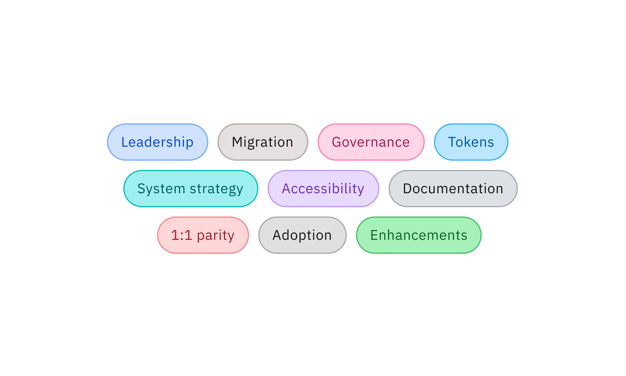
As a design lead and maintainer of the system, I help shape the components, patterns, tokens, and guidance that power consistent, accessible experiences across IBM products. My work spans design system strategy, governance, accessibility, component evolution, and achieving 1:1 parity with design and code. I lead initiatives ranging from individual component enhancements to large scale cross-functional workstreams, and have helped drive major system releases, migrations, and adoption efforts across product and acquisition teams.
Carbon Ecosystem
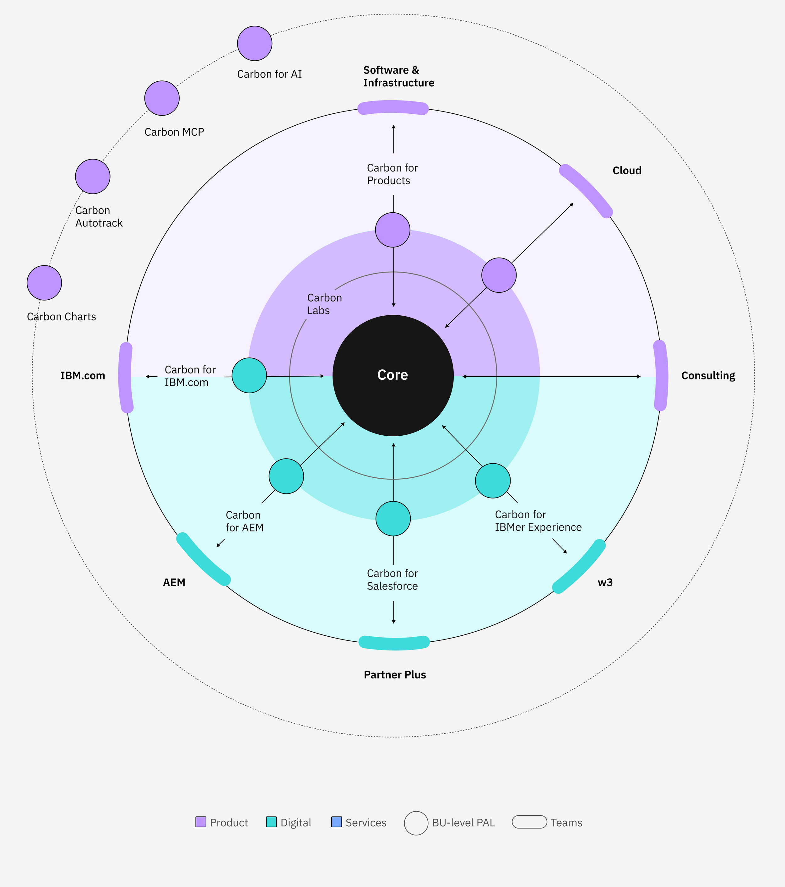
One Design System. Thousands of Experiences. Within IBM, every team that is building a digital experience is consuming Carbon assets and guidance.
Carbon is IBM's unified design system, providing the core elements, components, patterns, code, and guidance that power consistent experiences across products. Built on the IBM Design Language, it serves as a scalable foundation that teams can extend to address specialized use cases.
Below, I'll highlight a few key areas of the system that I've helped shape over the years. For a deeper look, explore the full Carbon Design System website.
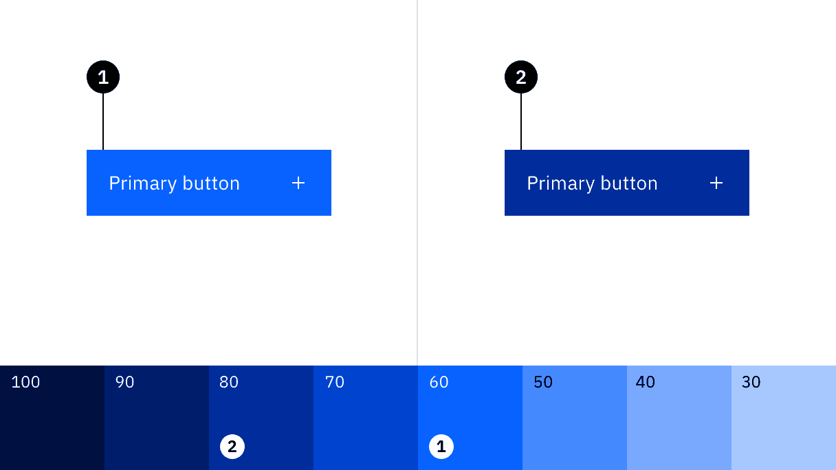
Color is one of Carbon's foundational token systems, supporting theming, accessibility, and visual consistency across IBM products.
During the Carbon v11 release, I worked with other designers to help modernize our color token architecture through semantic naming, contextual layering, and improved theming capabilities. Together, we audited and systematically renamed tokens to better reflect the tokens usage across the system to create a more intuitive foundation.
Color and theming
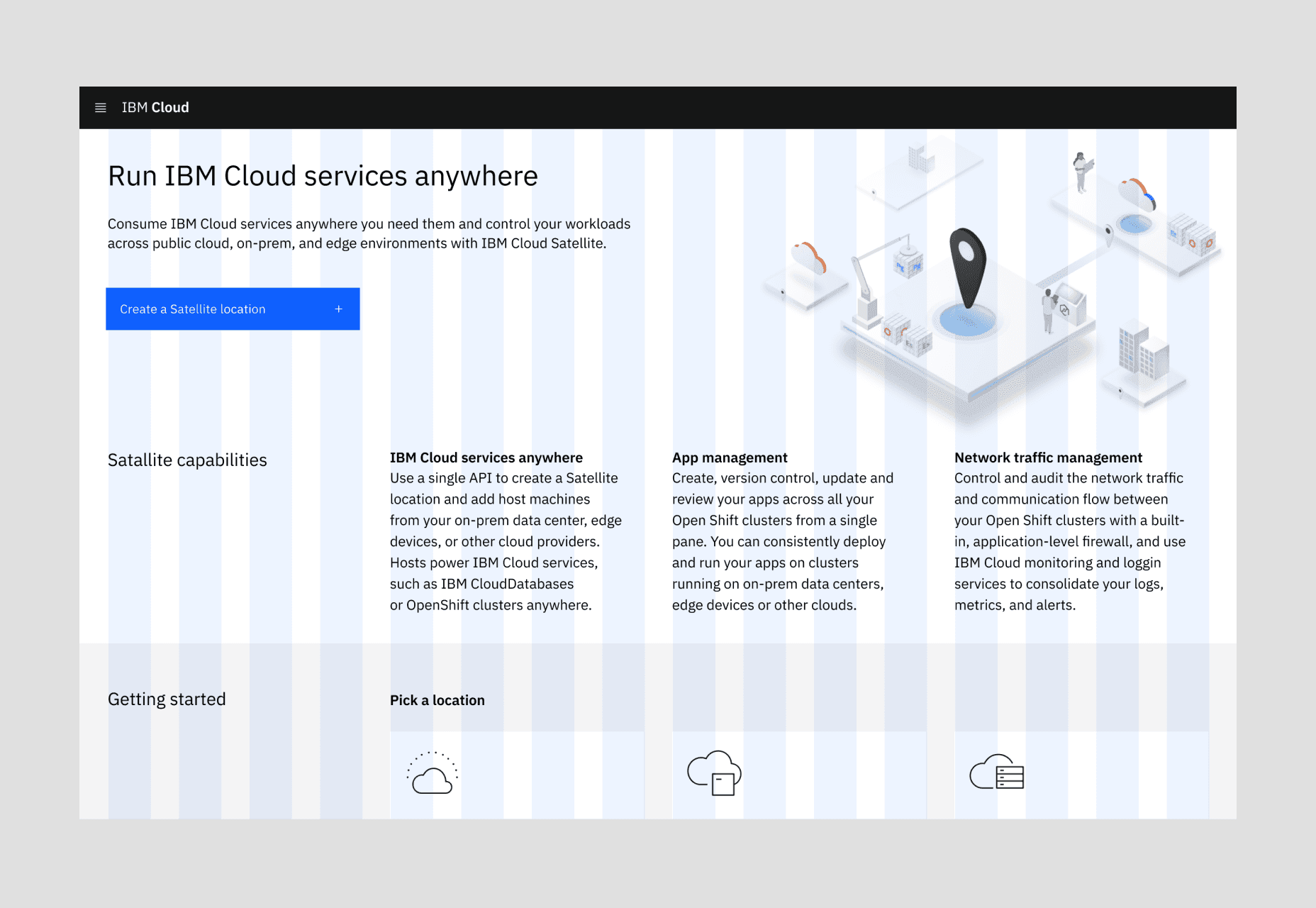
The Carbon grid is a flexible layout system that supports multiple breakpoints, gutter modes, and responsive behaviors across IBM products. I help maintain its guidance, support teams in applying it effectively, and ensure new components, patterns, and system enhancements integrate seamlessly with Carbon's layout framework.
Grid
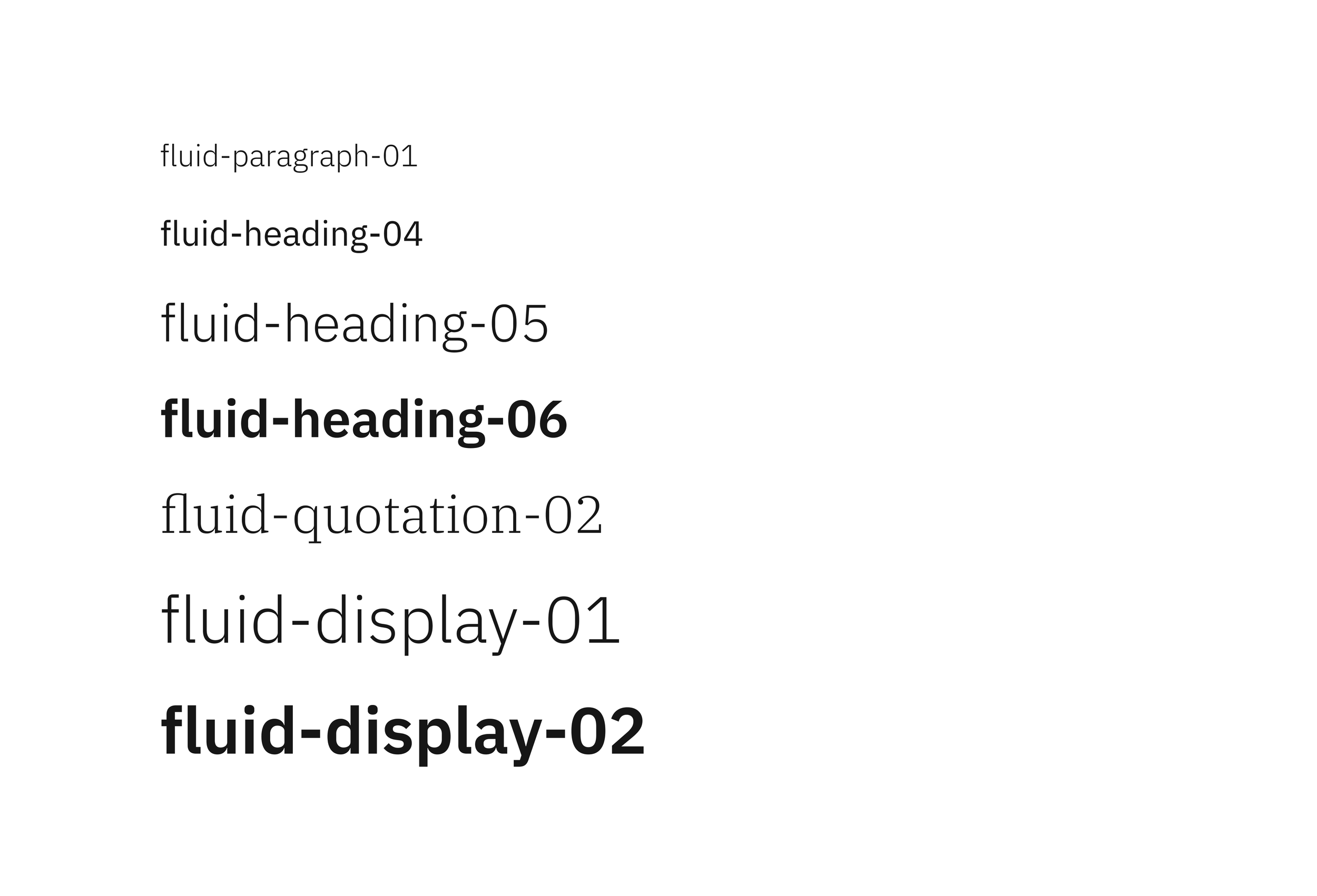
Built on IBM Plex, Carbon's typography system supports both productive and expressive experiences across IBM products. I helped define and standardize the typography token naming framework, creating a scalable system that remains the foundation of Carbon's type language today.
Typography
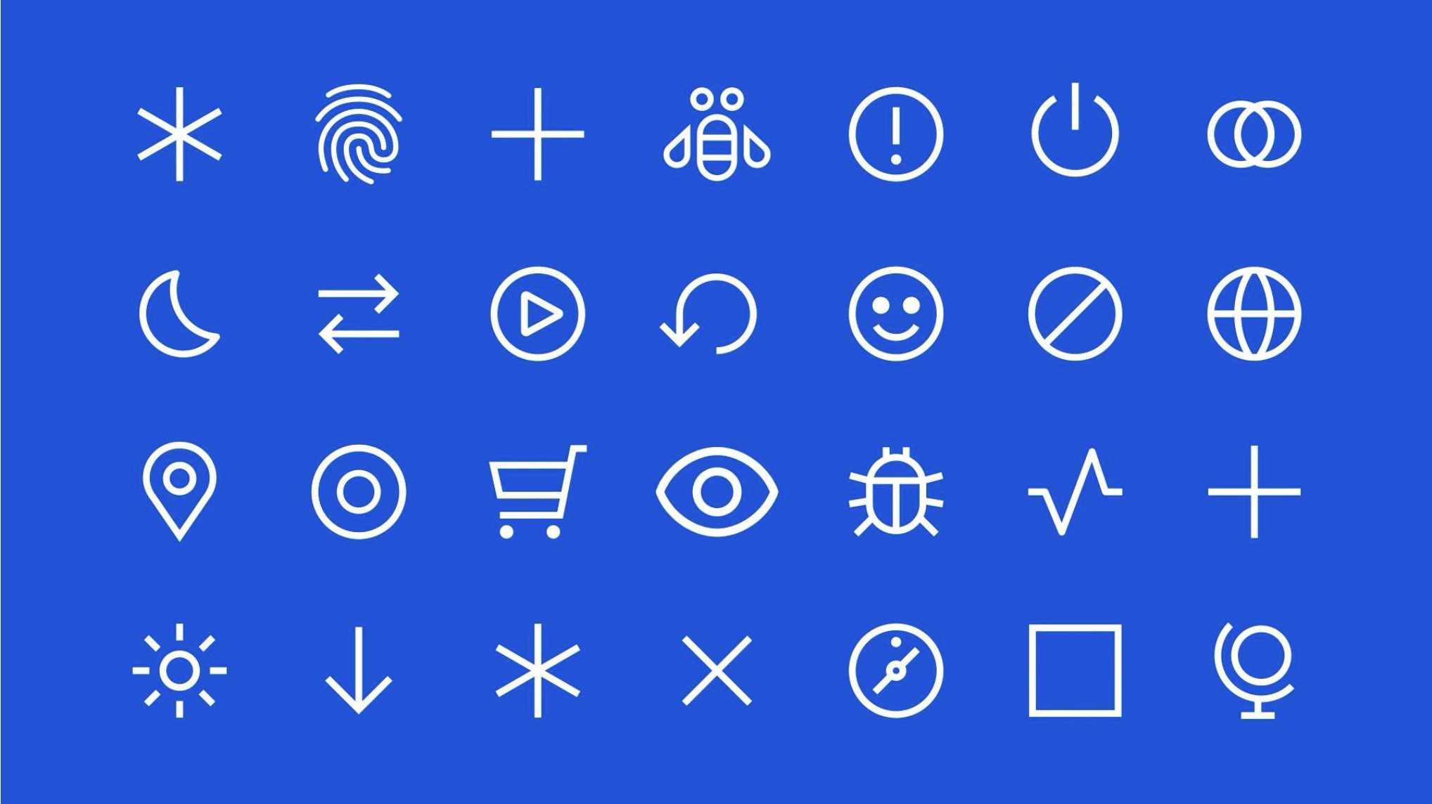
Carbon's icons and pictograms originate from IBM Brand. Carbon is responsible for making the assets available and usable across products. I maintain the supporting Figma libraries, participate in the review and approval process of new assets, and ensure they are integrated across the web, design tooling, and code packages in minor releases.
Icons and pictograms
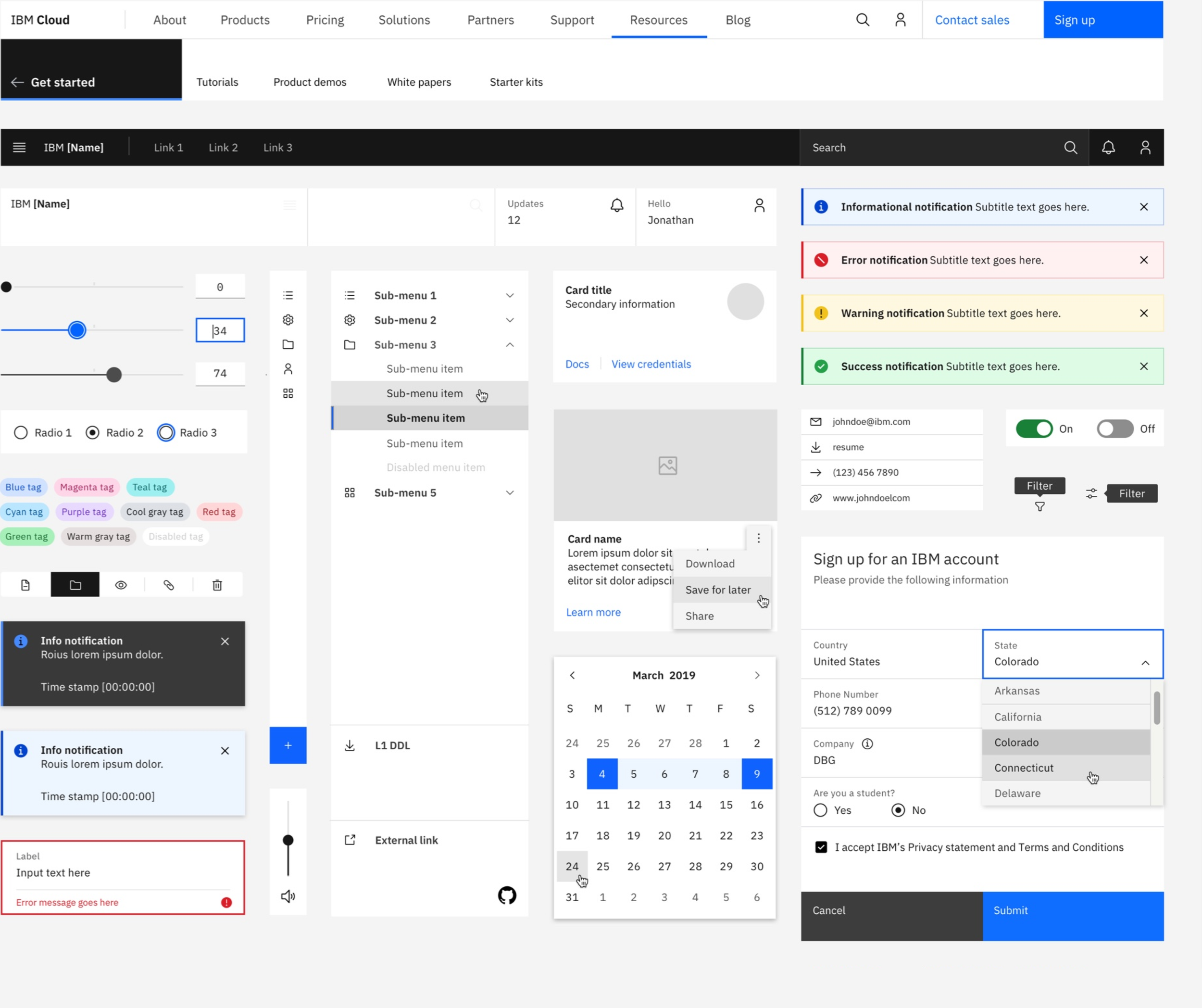
I have extensive experience creating net-new components and patterns, as well as evolving existing components with new variants, modifiers, and behaviors to better support IBM product teams.
This work includes research, competitive analysis, design exploration, accessibility considerations, responsive behavior, interaction states, and detailed design specifications. I also author usage, style, and accessibility guidance, along with supporting imagery, to help teams understand how and when to use each component or pattern effectively.
Components and patterns
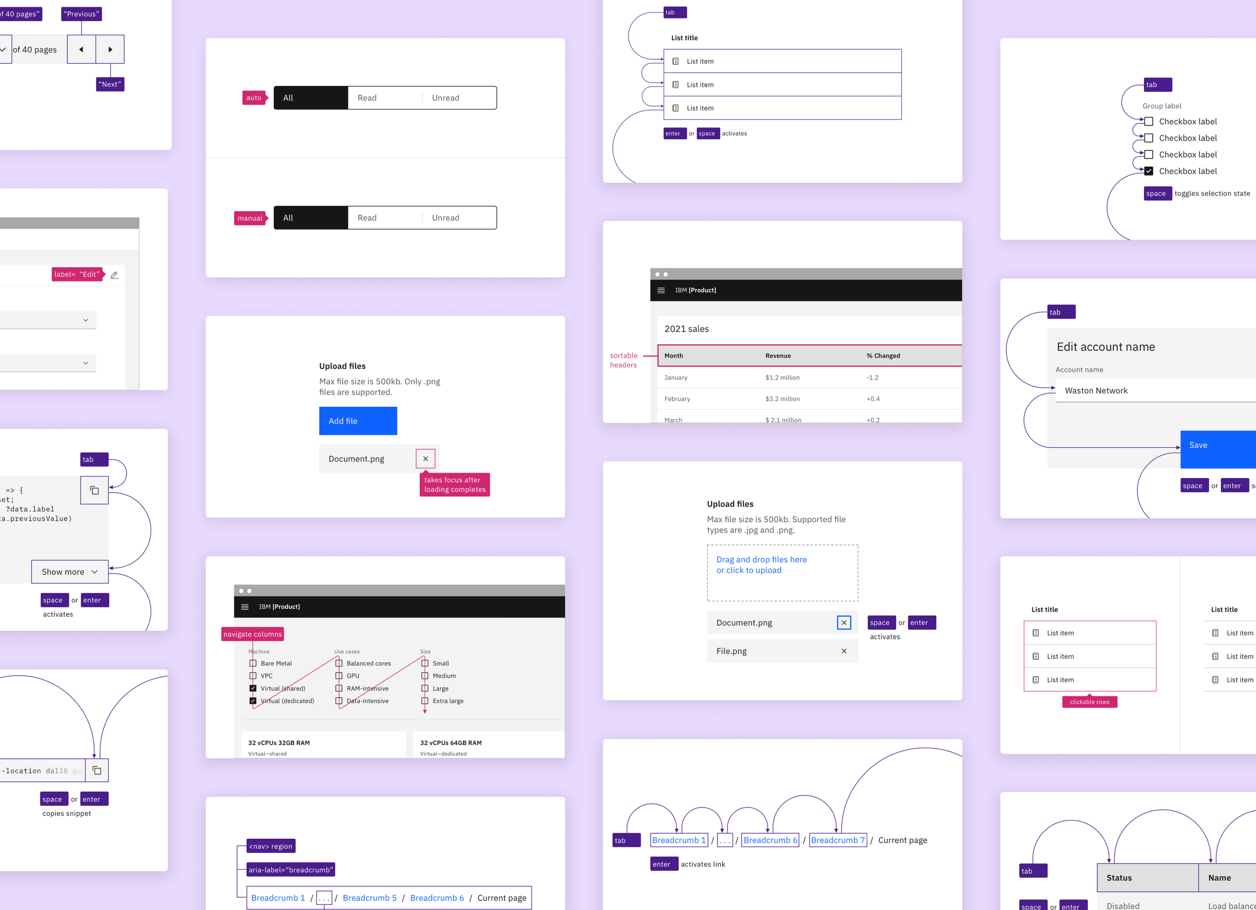
Accessibility is a foundational part of Carbon. I work closely with accessibility experts and regularly participate in accessibility guild discussions to strengthen my knowledge, validate design decisions, and ensure the system continues to meet a high standard of inclusivity.
I have also contributed imagery and content for Carbon's component accessibility guidance, helping translate accessibility requirements into practical guidance that product teams can apply across their experiences.
Accessibility
Carbon Design Kit
Scaling the Carbon through tooling, governance, and innovation.
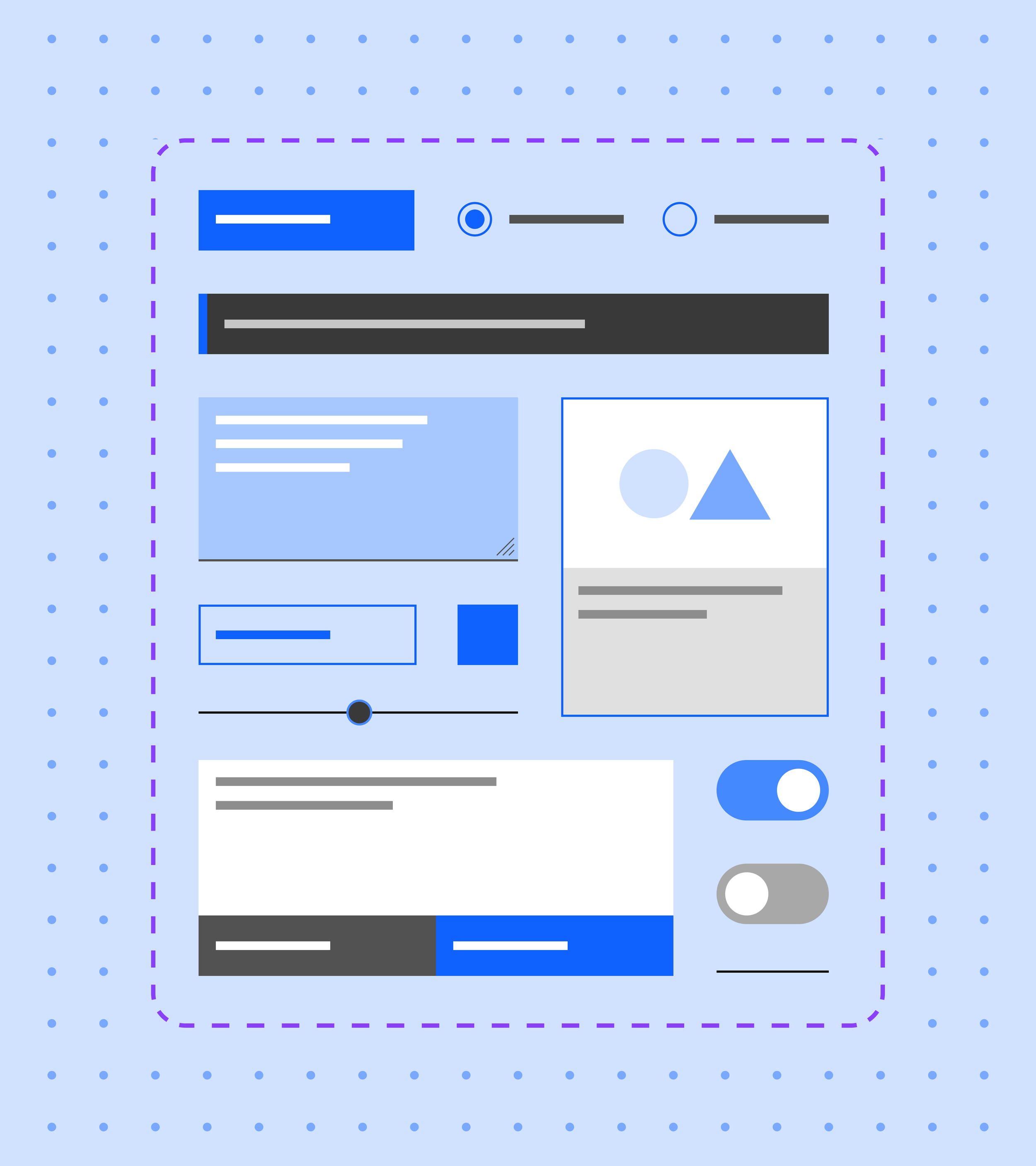
The Carbon Design Kit brings together the visual foundations of the system, including components, icons, pictograms, design tokens, typography, and grid templates. As Carbon evolves, so does the kit.
Carbon has several different libraries that house elements which feed in the core component library. View the core library in Figma to see how the system's components and tokens are structured and maintained.
When Carbon's design assets were spread across Sketch, Adobe XD, and Axure design tooling, maintaining consistency across multiple sources of truth became increasingly difficult.
As part of Carbon's transition to Figma, I worked alongside a small group of designers to help drive Figma adoption at IBM, secure licensing approval, define the architecture of Carbon's library, and support migration and adoption efforts across product teams. This work helped establish Figma as the single source of truth for Carbon's design tooling and libraries.
Design tooling migration and adoption
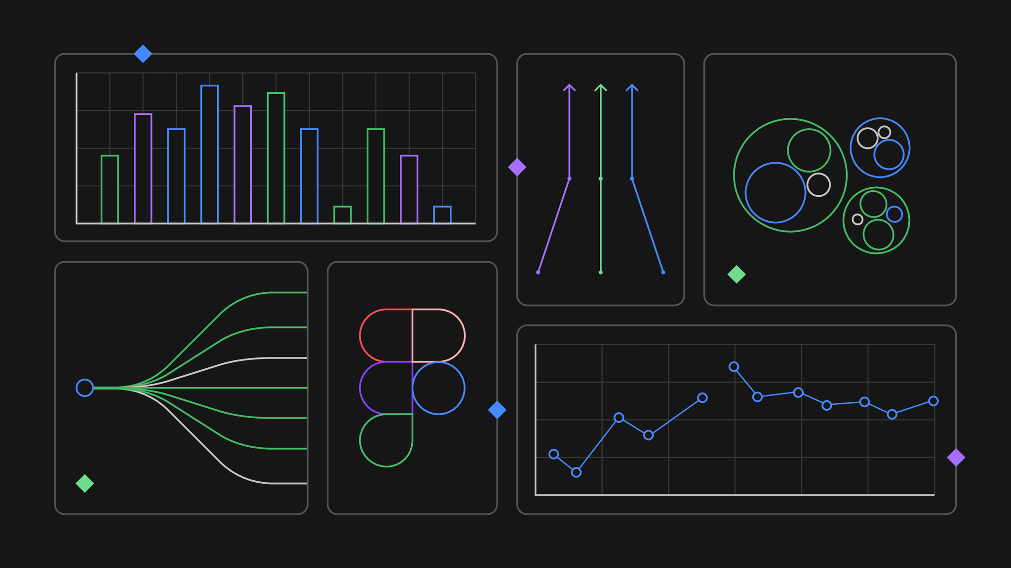
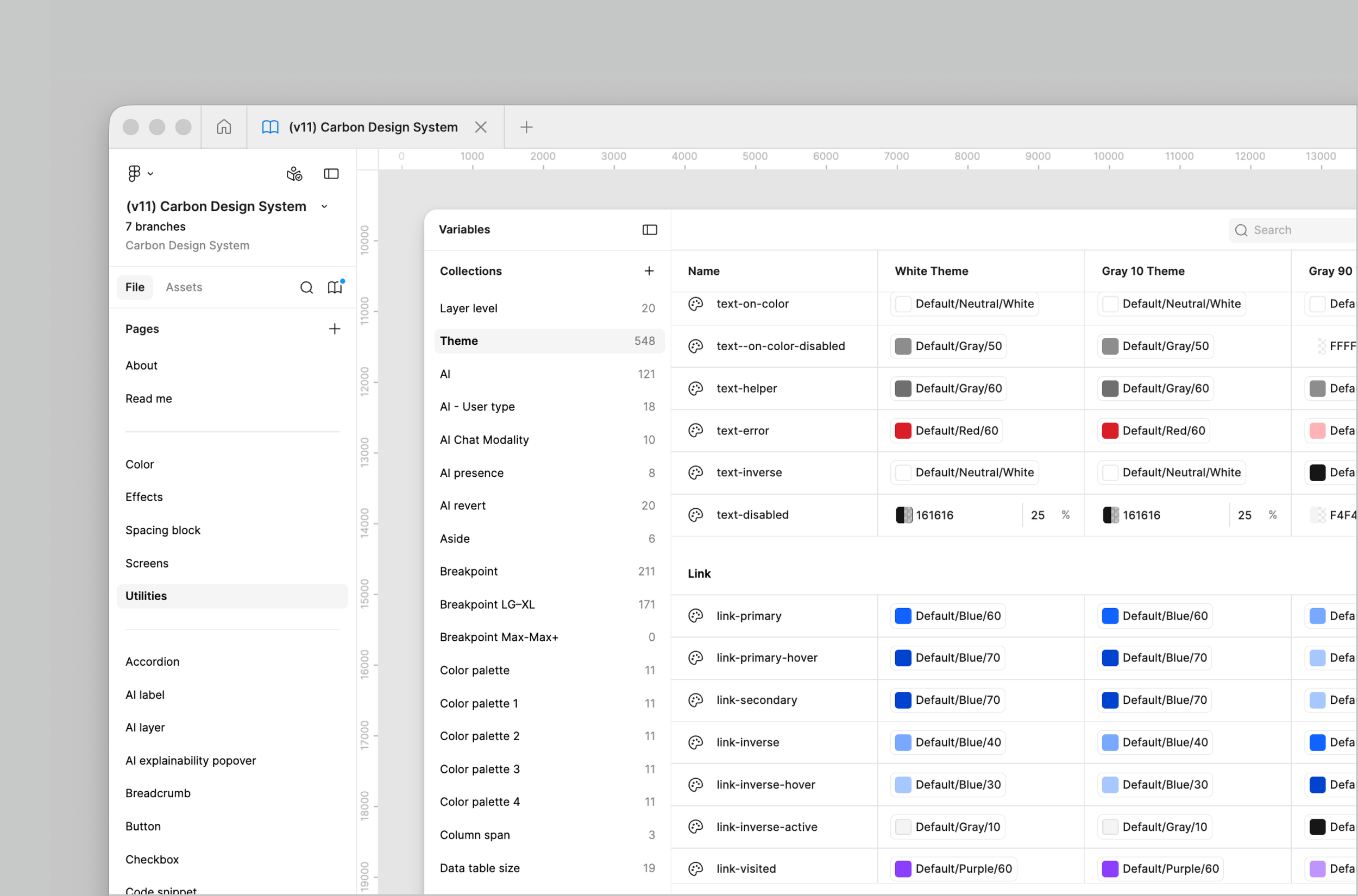
I help identify opportunities to leverage newly released Figma features to improve how our libraries are structured, maintained, and consumed.
Recent efforts include consolidating four separate theme libraries into a single variable-driven architecture, adopting variable modes to reduce complexity and maintenance overhead, and exploring density modes and new ways of changing sizes globally for components. We are right now exploring how to improve our slot usage in several components.
Features and modernization
What’s next? Carbon v12
Modernizing Carbon for the future of digital experiences.
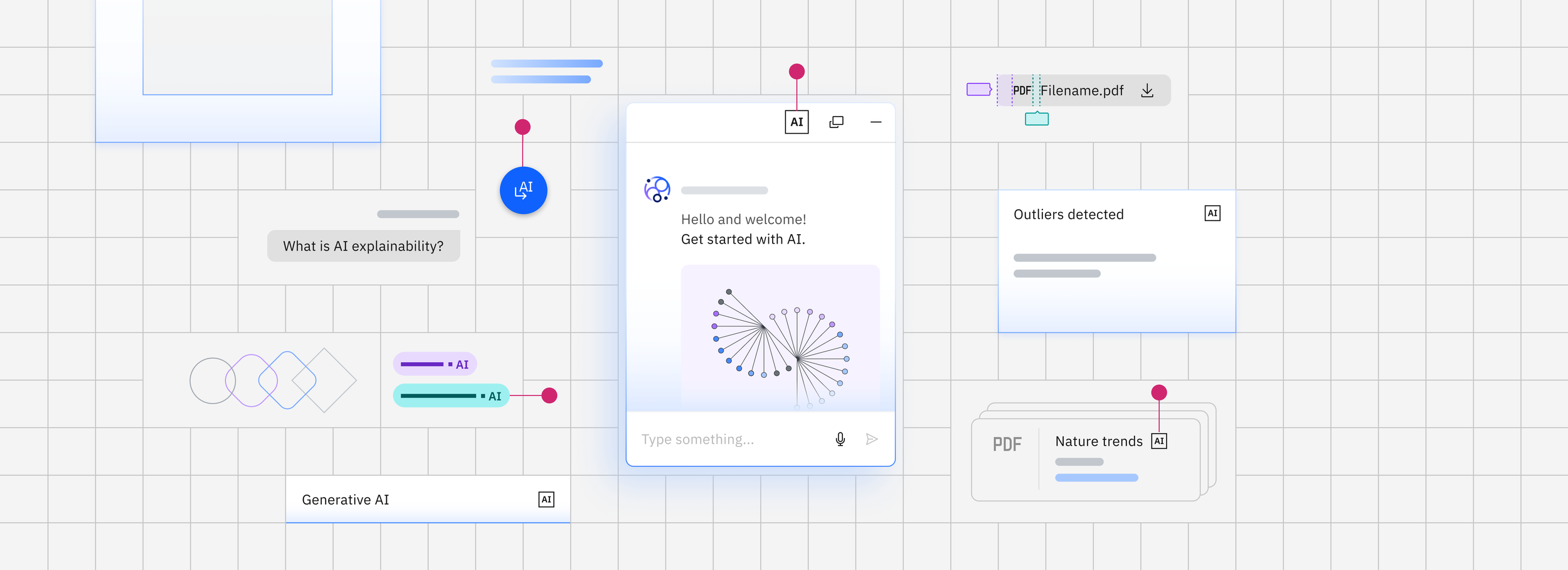
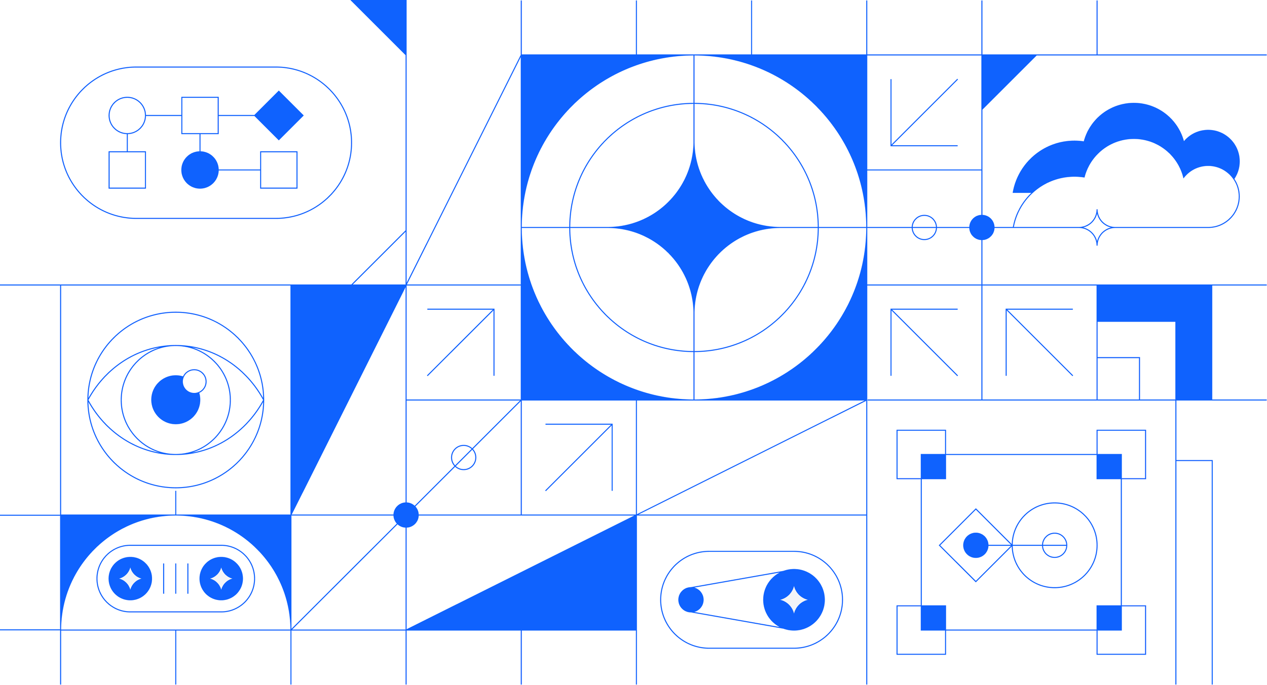
Carbon's next chapter is already underway. As we work toward our next major release, we're re-imagining the system to better support the future of enterprise software, including AI-powered experiences, through a refreshed visual expression, modernized foundations, and more flexible experiences.
Alongside the release, we're also transforming Carbon's digital website by consolidating multiple sites into a unified destination, creating a more cohesive and scalable source of truth for our community.
Red Dot Design Award
Award-winning work shaping the future of digital experiences.
The Carbon Design System received a Red Dot Design Award for 2022 in the Brands & Communication discipline. The design system was recognized as a winner in the Interface & User Experience Design category for creating an open source design system for products and digital experiences that are user focused and accessible to everyone, regardless of ability or situation. Read the Medium article I wrote below.

The team
A design system is only as strong as the people behind it.
Carbon's success is the result of collaboration across many disciplines, teams, and communities. While this portfolio highlights my contributions, the work represented here was made possible through the expertise, partnership, and dedication of countless individuals across IBM and the open source community.
Carbon Design System
IBM Brand team
IBM Accessibility team
IBM Design contributors
Open source community contributors